Showing posts with label Netherlands. Show all posts

Monday, 18 November 2013

Post- Impressionism: Vincent van Gogh

Vincent van Gogh (1853-1890) is probably one of the worlds most famous names in the history of art and we all know him as the bloke who does our portraits in the machines when we go bowling or to an arcade. He was Dutch and died very young at his own hand. He suffered from schizophrenia.

The Potato Eaters, 1885.
This shows the pre-Parisian style that Van Gogh started with. It is different to what we are used to. Still dark though which would suggest he was suffering from his illness for a long time. This is a depiction of peasants and has clear influence from the realists Millet and Courbet (think Stone breakers). It alludes to the lifestyle of peasants of whom would have eaten with the same dirty hands that they used to dig up the potatoes!

Portrait of Pere Tanguy, 1887-88.
Once in Paris he was obviously influenced by and introduced to colour and Japenese prints. The flatness found in Japanese prints influenced Van Gogh massively.

Night Cafe, 1888.
Van Gogh commented on this one that it is meant to be a depiction of the atmosphere rather than the true picture.

Starry Night, 1889.
He was no longer influenced by the impressionists, he began the expression of his (slightly cliche) tormented soul. Everything became increasingly twisted and expressive rather than impressive.

Self Portrait, 1889.


Self Portrait with Bandaged Ear, 1889.
After an argument with his friend, Paul Gaugin, he cut off his own ear. He did actually believe that painting helped regain his mental equilibrium. Here though, interestlingly, he is turning his back on his unfinished canvas and the Japanese prints that influenced him so much.

Wheatfield with Crows, 1890.
This was the last painting he ever painted before he supposedly shot himself though the chest. It is quite symbolic to think this was his last piece because, to me atleast, it seems as if the crows have been startled by a loud noise (like a gun maybe...) and are flying off. As my lecturer stated however, we can't assume this painting wouldn't have been painted had he not of killed himself. It may just be a coincidence, or not. Who knows.

Wednesday, 9 October 2013

Baroque, the art of persuasion

The term 'Baroque' is a definition coined in the 19th century by Heinrich Wolffin in an attempt to define a stylistic period. This means, as always, that it is not perfect.

Given that, the approximated dates for this period is 1600-1750.

The name comes from, oddly enough, a Portuguese word: Barroco, an irregular pearl that is both precious and deformed. The later Rococo (1720-1770 approx), which was very decorated, obviously derives from this too somewhat. Alternatively, the two styles can be amalgamated into one as simply 'Barroco'.

The characteristics of the Baroque can be identified by the use of mirrors, gold, swirls, grandeur, richness, emotional exuberance, movement, tension...you get the point. Mostly though, the Baroque put a great deal of emphasis on the unification of painting, sculpture and architecture.

As is true of every period of artistic movement or style, there is always a historical backdrop. Baroque too was a result of its environment. In the 17th century, all the states we can identify today were more of less established in Europe, except for Germany and Italy. There was also a religious war in the mix, at the hand of Henry VIII's split from the Roman church.

Although we all know Henry VIII turned his back on the Pope because of his wish to divorce, the Protestant force that came to be got their name from the verb 'protest'. Although the king took his stance for less than holy reasons, the people who supported him did so in protest of the Pope's behaviour; (if you've ever watched Da Vinci's Demons, although set a century earlier the Pope Sixtus IV behaviour wasn't massively exaggerated - and we can only assume the likes of Paul III were similar!).

Right so, the aftermath that ensued lead to Europe being split in two: Catholics and Protestants. The Protestants banned idolatric practice. In other words, Protestants did not believe in the use of idols in representing the holy. Thus, art in Protestant countries was far more rigid and scaled down than in the Catholic countries. In the southern Netherlands, being under Catholic Spanish control - see here - all churches were whitewashed and can still be seen today.

The Oude Kerk in Amsterdam, originally covered in frescoes but was white-washed by the Protestant church.

While the arts were being affected in this way on the Protestant side, the Catholics were also appropriating the arts to serve a new purpose...cue the 'art of persuasion'.

Between the years of 1645 and 1663, the council of Trent met 25 times to re-establish the beliefs of the Catholic church. The main principles were that the church had to become clear, persuasive and sublime; and to enforce this, they applied it to the arts. There was also recommendations from the council to portray realistic interpretation of the Gospel and an 'emotional stimulus to piety'. If the Protestant's turning their back on Catholicism was the reformation, then the Catholic church redefining themselves was the counter-reformation.

So why would any of this matter? because it influenced the likes of chuches in Gran Canaria here and art in the Netherlands as pointed out above and seen here/here. It was also very influential on architecture in England, Italy and France.

Thursday, 8 August 2013

Flemish Painting in the 17th Century

Right, so at the beginning of our timeline (16th century) the Netherlands belonged to the Kingdom of Spain. In 1568 7 very brave provinces rebelled against their ruler and after successfully creating their own little autonomous states they signed the Union of Utrecht to become a unified entity. This was the beginning of the acclaimed 80 years' war (it gets more confusing, there's a 30 years' war in the 80 years' war; so well acclaimed and given its own name because the whole of Europe got involved). Baroque

Phillip II wasn't too pleased and started a campaign to retrieve his lost territories, but was interrupted when the Anglo-Spanish war began (1585-1604). The Flemish took advantage of this distraction and were soon to siege Antwerp, defining the north/south divide. Therefore this takes us to the beginning of the Baroque period (circa 1600-1750) in the Netherlands. Where the scene was set for an autonomous northern Flanders and the southern Spanish Flanders. The north still wanted an absolute republic without the fear of Spain looming over them.

During the 80 years' war (or otherwise 'period of hostility'), there was what is known as the 12 year truce from 1609 onwards. There was an agreement made in Antwerp (Amsterdam) which put a hold on any hostile behaviour. In the Dutch series of events, Spain actually agreed for them to be declared a republic, but as is life the Spanish insisted that they only said that they may ACT as IF they were one. What this meant for the southern Flanders is that they were firmly under Spanish Catholic control without any annoying intervention; while the rest of the Flanders had free range to believe, do and trade to their hearts content. Makes for the perfect environment for an artist (lots of commissions!) which Rembrandt took advantage of.

Of course, this truce only lasted for 12 years, there was a failed attempt in 1621 to renew the truce - a bit of a lost cause considering a European-wide war had broken out that was to last 30 years. (Began out of the tension between the Protestant/Catholic countries; continued because of an array of political reasons). At the back end of this war however, was the Dutch Golden Age. The Netherlands gained recognition as a republic from the Spanish crown after the 1648 treaty 'Peace of Westphalia'. This was good news for the Netherlands, their important ports of Bruges, Ghent and Antwerp assured a wealthy country was to emerge. Alongside this, they were able to resume to their activities with the Dutch East India Company that they had established way back in 1602 (they weren't exactly compliant with Spain, they went about their colonial expansion business as normal!).

A Dutch East India Company official and his wife, with slave & view of Batavia, Java 1640-1660, Albert Cuyp
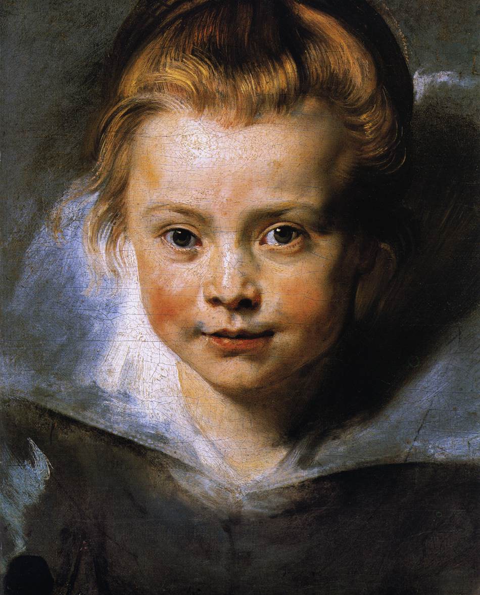


Peter Paul Rubens

Marchesa Brigida Spinola 1605


Portrait of Clara Serena Rubens 1616
In comparison to his earlier portrait, his palette had became far lighter and blonder. As a man educated in Italian art, the former clearly oozes what he had observed. This one however shows his style developing into something more similar to Baroque. It's in the small details, like the little strands of baby hair implying a living quality.


The Elevation of the Cross 1610
Represents his earlier, darker manner. Beginning to see the energy breathe throughout the picture. Having studied Venetian and Florentine tradition in painting he struck a particular interest in the Venetian 'Colore'. Other than Venetian influence in terms of colour, Tintoretto also had an impact on him. This can be seen in the figures appearing to be 'sucked' into the picture much like in Tintoretto's Crucifixion (1565).

Christ, although depicted fairly muscular here, there are probably far more men then was needed to carry him! Some have attributed this to the metaphor of Christ being so heavy because of the weight of sin.

There is a very random spaniel down in the right corner, other than being an allusion to the loyalty of the men carrying Jesus, it may have also been a way for Rubens to show off his ability to paint a variety of textures. Furthermore, the tendency to mix materials (multimedia effect) was common among Baroque painters...but in Rubens case, instead mixing materials he mixes imagery with sound (the wailing of a dog). This adds to the overall 'busyness' and noisyness in Baroque painting.

Also, take a look at the Hellenistic sculpture Lacoon and Sons (25AD). It obviously had an impact on Rubens. I like to draw a similarity between the relationship of classicism in ancient Greece and the Hellenism to succeed it with the Renaissance and then Baroque.


Samson and Delilah 1609-10
Painted at the same time as above just after his return from Italy. Again, Italian influences include the Michelangelesque muscular form of Samson. He is showing off his command of drapery (her pretty dress), virtuosity (the skill in which he can paint such little details such as fingers), narrative (he's now a pro after having seen all the countless Italian history paintings) and anatomy.


An Autumn Landscape with a View of Het Steen in the Early Morning circa 1636

Landscape with Rainbow 1635


Anthony van Dyck pupil of Rubens

Self Portrait, 1620-21
Portrays himself as a courtier, and shows the same virtuosity in his depiction of hands in the same way Rubens did.


Elena Grimaldi, Marchesa Cattaneo 1623
Painted in Genoa, on his travels (Rubens went to Genoa too).


Charles I with Monseigneur de St Antoine 1633
I believe that it is with this portrait that you begin to see the Baroque style influence Van Dyck. He still has Charles I looking as courteous as ever, however the horse and person beside it imply a movement throughout the picture. I think what is more notable is the fact that the horse and person (especially the latter) are even there to begin with - begins to show the ideals of portraiture slowly changing. 


Equestian Portrait of Chales I, 1633
The beginnings of movement I mentioned before appear in full force here; There is a definite essence of Rubens in the way that the man beside the horse appears to be rushing in through the door and the curtains flying about. Seems to me like there is a force behind them - much like we'd find in Rubens' work. There is also the very obvious indication of the baroque style - baroque architecture.

A common thing among portraiture of a monarch is the tendency to highly politicise the image. Here, the shield represents the unification (the word unification MODESTLY applied) of England and Scotland and the beginning of the United Kingdom in 1603 by James I.


Charles I 1635-36
Painted in order to send to Bernini - so that he could make a sculpture of him.


Frans Hals

Isaac Massa and Beatrix van der Lean 1622
A far cry from what portraiture was in the Renaissance!! The happily married couple acting like a married couple (enjoying each others company, joking around?) instead of the Arnolfini-like portraits of the man and woman looking bored and not particularly enjoying each other at all. ALTHOUGH the example I've shown below is probably the most tender of what the Renaissance offered in marriage portraits- Flemish painting was always less harsh than Italy's. Also, this is a far more realistic depiction of a couple in general. The woman isn't idealised, as almost everyone was in the Renaissance. She ain't too pretty.


The Arches of St. Hadrian 1633
The generic elbow sticking out to include the viewer into the space!


Laughing Cavalier 1630
Is this a real person or not? or mixture of both? no one knows.
This represents Hals advertising himself as having a distinct manner, definitive, rough, sketchy, (although unlike Rembrandt's use of impasto). His technique increases the sense of vitality in the Cavalier.  The image below popped up when I was searching for the actual image ha


Judith leyster
WOMEN also benefitted from the expanding market at the same time that painting was no longer seen as inappropriate for a woman to practice. In fact, women who liked to leisurely paint and look beautiful and insightful doing so were the archetypal well behaved daughter or wife.

Self Portrait, 1635
Sense of cheerfulness, loose brushstroke like Hals.
She's shown painting a genre painting of a boy playing a violin.

The Proposition 1631
A menacing man harassing a woman. If this didn't happen to be painted by a woman then I'm certain the woman would have been LOVING this. Leyster's used the candle here in conjunction with effective Chiaroscuro to create vitality and to emphasise the movement of the man and his shadow.


Gerard de Honthorst
Margharita Maria de Roodere and her Parents 1652
The idea that it was okay for women to paint was such a given now that even men would paint women painting!

Jan Steen
Jan Steen represents the freedom and playfulness that Baroque brought about.
For instance the old man groping the woman and the dog messing about on the floor! Movement, vitality, etc etc...
In the Tavern 1660's

The Artists Family 1663

Jan Vermeer
Was first and foremost the 'master' of genre paintings in the Flanders. He actually only painted 30 odd pictures. They were usually figures of women.

The Love Letter 1669
Remember the curtain.


Girl with a Pearl Earring 1669-70
A real girl or a 'Tronie'? (a type of character study that is dressed up, term used specifically for Flemish paintings in the Baroque era); If it is indeed a character study then Vermeer is breaking ground with using a woman as they usually do not appear in this type of painting. She is also dressed untraditionally.


View of Houses in Delft 1658
When I was looking for this painting I literally changed the search terms about 5 times trying to find the proper one - only I saw the proper one in the first place. Just looks too much like a photograph!


Gerrit Dou
Painter with a Pipe and Book 1640's
You may or may not remember the curtain in Vermeer's 'The Love Letter'.
The use of the curtain over what appears to be a doorframe in the previous case and the outside of a window in Dou's case is the following: It comes from the ancient Greek myth of Zeuxis and Parrhaus. They competed with each other to paint the most realistic painting possible. One drew a curtain over his painting and it was so realistic that the other tried to close it. So it's a clever play on that to impress us in the knowledge that he knows allll about ancient Greece; and he is congratulating himself for being such a skilful Baroque painter.


Wednesday, 7 August 2013

Rembrandt


Rembrandt Van Rijn (1606 - 1669)

Rembrandt is one of the most important painters and etchers in Dutch history, and European history for that matter too. He was about during what was called the 'Dutch Golden Age'. This era was brought on by the end of the 30 years' war in 1648. The war actually lasted 30 years as well, so don't let pub quizzes make you think they've given you a trick question. Rembrandt loved a bit of Italian art and in true Italian style he signed his work with only his first name just like the masters. It is probs not surprising then that 'Van Rijn' is just as little known as 'Sanzio' (as in, Raphael Sanzio)

Self Portrait at the Age of 34, 1640
This is a (relatively) young Rembrandt looking very much like a courtier with his courtier elbow.
Other than showing his grandness Rembrandt added the little detail of the sticky-out-elbow to allow the figure of himself to 'share' and occupy the viewers space.  His adoration for Italians is evident here. Titians Portrait of a Man 1512 is strikingly similar (bottom picture).


Self - Portrait 1661
This portrait later on in his life quite nicely shows the development in Rembrandt's manner, and in attitude too. His brushwork had become increasingly rough; while his facial expression and pose appeals to the idea that he was perhaps an old man getting even older gracefully (that's my opinion on it anyway, his expression kind of says to me 'What do you want now?' - he's abandoned the way in which he purposely portrayed himself as grand in the earlier self-portrait.) There was certainly more expression in this and some have even commented as a  portrait being 'a window into the soul'. Anyway enough of that... the expression, pose, and the paintbrush ajar from the rest ( as if he'd just put it down to acknowledge the onlooker ) all are signs that point towards the Baroque style coming to the Netherlands.

You will notice that once I get to the etchings at the end, 10 years prior to his self- portrait above, Rembrandt etched another self-portrait. You may think the style of that contradicts what I've said here BUT that is believed to be a character study of himself - not the same genre and certainly not used to advertise himself on the same scale as (above) would have been.


Jan Six 1654
The portrait of Jan Six, a very good friend of Rembrandt and the son of a wealthy merchant family in Amsterdam. This portrait is now part of what is known as the Jan Six Collection. The Six family, (and partially the van Winter family whose daughter married one of Jan's descendants) had too much art to know what to do with.

As it was done only slightly before the self portrait shown above, it is the same in style, and ideology. This man is meant to be wealthy and powerful - yet his face and indirect glance makes me feel uneasy. He looks kind of sad, or perhaps fed up. Rembrandt gives him individuality above his outward social identity.


The Anatomy Lesson of Dr Nicolaes Tulp 1632
This is the body of a condemned robber who was executed, a little bit harsh but Dr Nicolaes Tulp had a job to do - to teach the populace how to locate the tendon in your forearm. Pointless? Oh.
There were actually 'dissection theatres' in the Netherlands, and they used to be open to the public!
I've jumped backwards here but it makes it easier to see how radically his brushstroke was altered. He paints so much clearer here. Certainly Baroque though, no sense of movement from the executed robber however the man to the left of the dr can almost be seen to say 'you lot over there, have you seen this?! its mental'


An Anatomy Lesson of Dr Deyman 1656
Jumping back to the 1650's just to emphasise again the difference in his brushwork and seeing as it's the same genre it's nice. Just a side note, when I was google searching to get this image, another anatomy lesson popped up, and it was of a baby! eugh.

A lot of this was sadly destroyed by a fire. My lecturer said the most odd thing about this, apparently this image was momentarily used for stamps in the republic of Tongo? Is there even a republic of Tongo? Did I hear wrong? Why would they want this as a stamp? Hm.


The Nights Watch 1642
They reckon this one was atleast 20% bigger and cut to fit into the required space when it arrived at the Amsterdam Town Hall in 1715. The two men at the front of the group were presumably in the centre of the composition. This painting has an awfully long official name: 'The Militia Company of Captain Frans Banning Cocq' but was assigned this name by our very own Joshua Reynolds in the 19th century because it had been tampered with time and time again to leave it looking like a night scene; when in fact, it is in broad daylight. The men are the 'militia company' of so and so but we're not quite sure what they were doing, or preparing to do rather. The majority of the faces in this painting are the 17th century equivalent to what would be an 'extra' on eastenders (except they paid for it themselves although I'm sure there are people out there who would pay...) Rembrandt uses a lot of movement in this scene, which caused some controversy for such a formal matter. He also used foreshortening, impasto, tenebrismo. Through and through Baroque.


Blinding of Samson, 1636
This is a scene painted from the old testament: Samson was a man granted supernatural strength by God but was ordered to NEVER cut any of his hair. He set off to travel and came across a Philistine woman and fell in love. Little did he know she was a bitch and trying to figure out what his weakness was. He told her. She cut off his hair while he slept. He was taken away by the Philistines.

This scene is typical of a history painting. Rembradnt was proving he had the capability to paint one. He rarely got the chance seeing as the Netherlands had no monarch or church to paint for (being a protestant country with a bad case of aniconism and all). Here, he had been commissioned to paint by a private patron: Huyghens.

This style is very Caravaggiesque with tenebrismo and a sense of realism (look at samsons face - that is not heroic - he has curled up toes too, he is obviously in pain). However, it is more finely finished that anything Caravaggio ever did. Rembradnt was known to admire Caravaggio but only had one problem: his use of impasto.

Other influences include Gerrit Van Honthorst's 'Merry Flea Hunt' (1621) although the subject matter was far more noble. Another is Rubens & Snyder's 'Prometheus Bound' (1611-18). The pose is almost identical.

Realism mixed with the grandeur - typically Flemish.


 Belshazzar's feast, 1635

The subject is that of Babylonians at a feast. They had stole plates from the Temple of Jerusalem and the Hebrew reads something along the lines of you've been 'weighed in balance and wanting by God'.

The clothing here is Baroque, the rich patterns and the elaborate turban. Rembradnt had actually copied Mogul drawings, being the first western artist to do so.

The people here are clearly shocked which means there is a sense of drama. It is important to point out as well that their faces are not idealised. As with architecture, Baroque painting is defined by a sense of movement; this is achieved in the neck of the water vessel pointing towards us, with water flowing.

 
Conspiracy of Claudius Civilis, 1661-2
Depicting a conspiracy to overthrow the Romans, the subject matter could maybe reflect the political relationship (a submissive one) between the Netherlands and Spain. Netherlands wanted Spain out.
 
The characters are conducting a 'sword oath'. This scene has been repeated time and again for mainly nationalistic purposes. For example Fuseli's and David's paintings.
 
 
The three crosses 1653
Rembradnt was probably more well known for his prints. This print is an etching, a technique which involves a layer of wax on top of a copper plate. You use a thin tool to etch the lines into the wax. The wax and copper then soak in acid and the end result is that the wax bites into the copper and leaves marks on the surface where you had removed the wax; then the ink can be applied to the crevices.

This etching shows Rembrandt's mastery in Chiaroscuro in even print. I really hate prints, so boring.
 
The hundred Guilder Print 1647-8
This print is an example of the popular interest in Rembrandt's prints. It was so amazing that apparently someone even bought it for 100 guilders.........I have no idea how much that equates to.
 
 
Self Portrait in a Cap, with Eyes Wide Open, 1631
A character-like study of himself, he's used the etching technique here but the coarser lines are the product of him also using the burin of the dry point technique.