Thursday, 8 October 2015

Asam Church, Munich

 
Stumbled across this gem whilst trying to get out of the cold and rain in Munich last weekend. My friend and I couldn't believe how gorgeous it was. Ostentatiously and sublimely Baroque in every sense. Multiplicity of materials, colours, textures and gems - terrifyingly impressive and equally as intimidating - walls so convoluted that the space is literally moving.
 
Asam's Church, or otherwise known in German as Asamkirche, was built between the 1730s and 1760s by two brothers called Egid and Cosmas Asam (hence the name).
 
Originally intended for private use as a private chapel, it soon outraged local residents and was opened to the public.
 
The design is densely rich and faithful to the Italians and their high Baroque. It is reported that the artistic brother of the two Cosmas (who was responsible for the incredible tromp l'oeil fresco on the ceiling) travelled Italy extensively and therefore would have been influenced by what was going on there.
 
The church is divided in three, similar to many other holy places. This of course is alluding to the father, son and holy spirit. This was not new. Think of every single Florentine church between the years 1450 and 1550, they'll be divided into three. Think of Constantine's arch, and every subsequent triumphal arch since... divided into three. However, what made this one different, is that the divide into three was not on the exterior and therefore not immediately obvious. It was on the inside. The bottom is dark and demonising, as if to represent the seminal sin that humans share on earth. The middle is lighter and glamorous, to signify God's dignitaries on earth - the kings and emperors that he had supposedly anointed. Lastly, the ceiling, is light and beautiful and pointing upwards into the sky, to represent heaven.


Red House

 
Last week I visited Red House, in South East London. It was the home of William Morris and is the embodiment of his beliefs and attitudes towards the arts.

It was built in 1860 by architect and friend to Morris, Philip Webb. It is now maintained and owned by the National Trust who have carried out extensive restoration on the property, although only having acquired it 10 years ago.

The arts and crafts movement was borne out of the discomfort caused by the dismantlement of traditional craftsmanship and the changing face of the British landscape. These changes were caused by the ridiculous pace of change set by the industrial revolution in Victorian England.

Morris, along with the likes of Ruskin and Pugin, were deeply concerned for the future. All three men shared similar concerns. They all wrote poetry, novels and alluded to a better time in Britain's past when all craftsmanship was vernacular and society more harmonious. Morris however, had one interest in particular, above all: medieval churches. His favourite being Inglesham, a derelict, mouldy little church in the middle of Wiltshire. While his contemporary, George Gilbert Scott, was 'renovating' Britain's medieval remains and therefore distressing Morris further.

Morris' response therefore was to help establish the Society for the Protection of Ancient Buildings, alongside creating a whole new ideal for the Victorian 'Golden Age': the Arts and Crafts Movement.

The Arts and Crafts therefore had tradition at heart. Specifically the tradition of Medieval England. No machines, 'proper' craftsmanship and buildings that evoke the past that are both beautiful and considers the environment that surrounds it. The idea was not limited to just architecture though, it spread across interior design and furnishings, whilst finding its fine art equivalent in the pre-Raphaelite's.

The end result (his adored family home) is therefore a very beautiful building to look at. Although, admittedly, the Victorians created much more beautiful buildings with the help of technology in my opinion.

Nonetheless, Morris absolutely loved it. He loved it so much he actually moved his workshop from London so that he didn't have to stray so far from the area so often. There are some pictures of Morris' home below.


This sideboard is in the dining room. Arts and Crafts furniture is not always the prettiest, and is definitely an acquired taste. However if you know the reasons behind the quirkiness they immediately become a bit more charming. Furniture at this time was largely influenced by Charles Eastlake who wrote a book called 'Hints on Household Taste'. Victorians were only just beginning to understand the notion of bacteria, and how it can make you ill - although they had no real scientific way to describe it at that point and they assumed it was dust that made you poorly. Therefore furniture became larger with most open storage hidden away higher from the ground, while the base of the furniture often left a gap underneath to easily clean and dust. Also there is a wombat hiding in the top right of the dresser. Apparently a pre-Raphaelite motif that Morris liked and therefore integrated into his home.

 
This is a close up of one of the ceilings. Notice the tiny little guide dots, these enabled his 'less arty' friends to join in on getting the house complete, by simply painting between the dots. This is also handy in enabling conservators to easily recognise that they are doing the restoration correctly. Although, one of Morris' main issues with practices from his day was conservation - if it was his decision the house would have probably been left to rot and therefore evoke the 'golden stain of time'.


If the National Trust had heeded his advice though, what would have become of this?! So pretty. There is also a smiley face hidden up there somewhere, probably the handy work of one of his friends!

 
Another wombat...

 
I believe this was his wife's bedroom. The real wallpaper is currently being revealed under layers of paint, wallpaper and plaster from subsequent owners.


Some beautiful examples of his wallpaper. All heavily restored of course but gorgeous nonetheless. Typical of his style were the stylised images of plants and flowers. Slowly developing towards completely stylised shapes that were to define most of the first half of the 20th century in a whole host of ways (cubists, art nouveau, art deco, the Glasgow School of Art, the fauves, Italian futurism, pointillism, etc).

 
In what was the children's room there are books on display of his works for the grown ups (particularly his wallpaper designs), and lego and crayons for the children...


Uncovering some more secrets of the house, a mural him and his wife painted together there to the right.


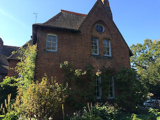
Terrible photos of the exterior, although you can clearly see how it's meant to look organic and like it fits in with the countryside (that now has a lovely main road near it).
 
The end

Monday, 8 June 2015

Torre Tavira

Torre Tavira is situated in Cadiz, Andalucia, Spain. It was originally a watch tower, sat at a vantage point of 45m above sea level, but now is home to an exhibition on the Camara Obscura.

The camara obscura represents photography and its humble beginnings. It was the stepping stone from which an image was transported onto another surface. Obviously our ancestors were yet to master how to make that image stick. Henry Fox Talbot was to later produce the Calotype method during the Victorian era but up until then it was the camara obscura that dominated the scene.

The Camara Obscura literally means the 'dark chamber', referring to the blacked out room they would be placed in in order to create a live image. This 'dark chamber' has lived on though, in the form of rooms devoted to developing photographs.

The Camara Obscura as a concept is as old as time but was a term that was only coined in the 17th century by the astronomer Kepler.

The exhibition is lead by a member of staff actually using the camara obscura. They take you through an explanation of how it works. Briefly, there are mirrors at the top of the tower that project an image onto a crater-like white bowl in a blacked out room. The mirror is connected to a lever whereby the people using it can adjust the mirror, moving it back and forth, to increase/decrease focus and to change direction. The focus blurs a lot the closer you get. The image that is projected onto the bowl is a live feed of what is going on in the street below.

The man leading the exhibition was brilliant. So much fun.

At the end you get to go up to the top and see the city of Cadiz.

Here are some pictures:


Cadiz Cathedral

I visited Cadiz a few months back and had the chance to visit lots of pretty places (I wrote about our visit to the museum here).

One of the magnificent places that I was able to visit was the cathedral, known as Catedral de Santa Cruz de Cadiz.

The cathedral took over a century to build because, much like all the other impressive cathedrals around Europe, no one ever had enough money. Construction began in 1722 and was completed in 1838. It is currently the seat of the diocese of both Cadiz and Ceuta, one of the two Spanish autonomous communities in northern Africa. Its importance to heritage has been acknowledged by a heritage register in Spain known as the Bien de Interes Cultural, meaning Heritage of Cultural Interest. You can visit the cathedral for a small price and it is well worth the money. It is situated on the aptly named Plaza del Catedral and there is a blue print of the building itself on the space in front of it. My friend tried to point it out for me but unfortunately it was hidden by the setting up of the stages for their festival over Easter!

You are offered an audio guide which comes in a handful of languages. We picked some up although listening to it all would take you hours.

 
The Baroque exterior. It has a look of almost every single other Spanish church or cathedral I have seen from the period. They loved a Borromini style recess and protrusion coupled with a bright and cheerful render. I think that is perhaps the most pronounced element of Spanish Baroque, the facades are airy and maximise the power of the Mediterranean sun. The effect of light on these buildings produce a sense of awe much akin to the mission of the baroque style: to impress and intimidate. The cupola's either side of the hilariously magnified pedestal on which the equally as funny tiny pediment sits remind me of Wren's St Paul's. The style is not solely baroque though, although most certainly a large quantity of it is(the exaggerated-ness of it definitely gives the building an overwhelming sense of the baroque), it also has elements of the rococo and neoclassical.
 
The architect responsible for the design was Vicente Acero, who also produced the designs for the cathedral in Granada. The designs were drafted almost two whole centuries after the 13th century cathedral that originally stood there had been burnt down. Like Granada's cathedral the outcome strayed slightly from the original design due to the time scale in which it was completed. This accounts for the neoclassical and rococo elements.


The cathedral contains much of its past within it, in the form of relics and such. Not only that, it also represents churches in the area, with parts of their collection having been amassed over the years from their neighbouring places of worship.

 
If you recall me mentioning rococo, here it is. Serpentine columns and an abundance of different materials, textures and colours used at the same time.


Two very different pulpits. The first is the kind you find in the larger, more important cathedrals and the bottom is more of a modest one that you might find in your local parish church.


The beautiful neoclassical dome strung out on pendentives. You can kind of see the netting beneath it. This netting covered almost all of the roof and if you looked close enough you could see big chunks of plaster caught in them. Really sad that its so delicate, it obviously needs a lot of attention.


The entrance into the crypt.

 
The photos below are of the crypt where important figures from Cadiz have been buried. Most notably Manuel de Falla, a famous composer.


Looked Dali-ish to me


Very purrdy
Will have to visit again